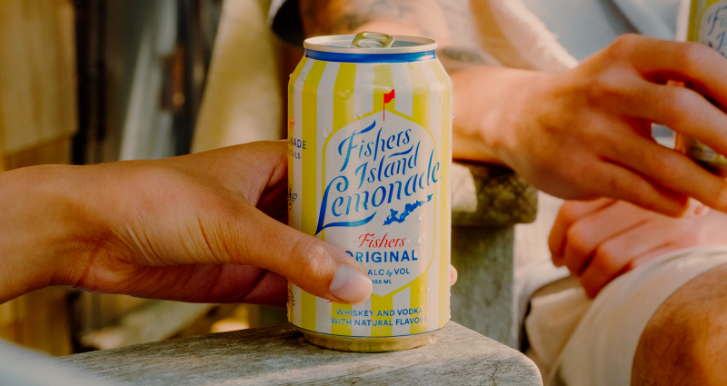
Back in 2014, while she was bartending at the storied Pequot Inn, Bronya Shillo founded the craft cocktail brand Fishers Island Lemonade. Now, as it celebrates its 10th anniversary, Shillo has collaborated with Brooklyn-based branding agency Tavern to build on these foundations with a refreshed brand experience that provides a fresh yet familiar take on its classic coastal aesthetic.
With the amount of growth that has happened since the launch, Fishers Island Lemonade needed a visual identity that could cope with the evolving needs of the business and its consumers. In the spring of 2023, it was acquired by the spirits arm of E&J Gallo.
For some time, Tavern has been working behind the scenes with the parent company’s new business team to take newly acquired brands, including Fishers Island Lemonade, to the next level.
“We’re always excited to work on brands with an interesting story or heritage to build on,” says Tavern founder Mike Perry. “Fishers Island Lemonade may be a young brand, but its story, interwoven with the heritage of Fishers Island and the famous Pequot Inn, was an exciting jumping-off point for a brand refresh.”


Like Fishers Island itself, the brand is meant to feel luxurious, indulgent, and premium yet simultaneously laid-back and casual. To achieve this, Tavern developed a brand to attract consumers seeking an elevated experience that justifies the product’s elevated price point.
Perry explains how the whole brand world was built around the idea of “a long weekend away at your favourite retreat”, whether that’s Fishers Island or somewhere else. “It’s all about indulging in the joy and comfort of a familiar escape, and whether you’re on vacation or wishing you were, a Fishers Island Lemonade hits the spot”, he adds.
This elevated notion is encapsulated in the brand’s new tagline, “Worth the Squeeze”, which suggests that Fishers Island and its lemonade are worth that extra effort (and money). Another important aim was to create a brand platform that could adapt to local markets, so the tagline could be built out into ownable brand phrases, including: ‘make [the trip to your destination] worth the squeeze’; ‘make ferrying to the Vineyard worth the squeeze; and, ‘make the 4 hours to your country home worth the squeeze’.


When asked how Tavern elevated the brand without losing its equity, Perry says: “Luxury brands don’t beg for attention; they command admiration by selling an aspirational lifestyle first and function second.”
This approach was taken with brand photography, resulting from a lifestyle photoshoot that taps into the brand’s provenance and adds an authentic layer of nostalgia. Every shot was taken to paint a picture of a long weekend getaway on Fishers Island, and Tavern honed in on several vignettes, including a day on the beach, trekking to a great picnic spot, and stopping by a farm stand to get ingredients.
Perry describes the Fishers Island laid-back lifestyle: “It isn’t about keeping up with the times; it’s about slowing down to enjoy the present moment where you are.”
Tavern looked back at vintage J Crew, Polo, and LL Bean catalogues for inspiration, borrowing cues from the styling and art direction of the past but with a contemporary twist and design. According to Perry, the result is “a timeless aesthetic that balances a sense of heritage and modernity”.”


In aid of retaining equity, Tavern didn’t completely throw out any brand assets. Instead, they evolved and re-imagined them to make the overall look more cohesive. Like the photography, Fishers Island’s new editorial style is inspired by vintage catalogues from New England-esque brands like J. Crew, Polo, and LL Bean.
The brand voice is applied in a new typeface from PangramPangram called Editorial New, chosen to complement and elevate the broader, editorial-inspired identity system. The foundry described it as having “a big enough personality to make a statement as a title”, as it’s based on old masthead lockups but has been modernized to be read as body copy.
Tavern also changed Fishers Island Lemonade’s logo, opting for a horizontal wordmark off-pack. Perry says that this version “feels more premium and considered in the context of the editorial-inspired brand world”,” adding that the studio also optimized its legibility.
He explains that the monogram – based on the idea of vintage ivy and New England prep monogramming – was created as “a tertiary brand element to add variety and interest to the broader brand world” without needing to use the full wordmark.
Fishers Island Lemonade’s illustrations were done in-house at Tavern and were designed to feel like they came from a nostalgic souvenir shop. “Any of the illustrations would be right at home on a hat, t-shirt or mug you’d bring home as a memento of your summer on the island,” says Perry.
“We wanted the style of the linework to feel very charming, human and unscripted – the opposite of digital.”
He reveals that one of the biggest changes to the brand was the role of its bright yellow stripes. A new graphic asset in the form of a striped beach umbrella sits just at the top of the frame, replacing the previous bold wall of yellow and white. Perry says: “The yellow stripes became a subtle nod to the feeling of peering out from under an umbrella on the beach, relaxing and enjoying the view.”
It also appears as a motif in the brand’s lifestyle photography, with striped items integrated into many of the lifestyle vignettes. “We kept it subtle, though, and made sure to avoid letting the stripes overpower the broader scene in any image,” explains Perry.

