 Skip to content

Tashreef’s fascination with consumer technology began in the school library when he stumbled upon a tech magazine, CHIP, which ultimately inspired him to pursue a degree in Computer Science. Since 2012, Tashreef has professionally authored over a thousand how-to articles, contributing to Windows Report and How-To Geek. He currently focuses on Microsoft Windows content at MakeUseOf, which he has been using since 2007.
With hands-on experience building websites and technology blogs, he brings practical developer insights to his technical writing. You can view his complete work portfolio at itashreef.com.
You might also stumble upon his short how-to video explainers, simplifying complex topics. Beyond writing, Tashreef enjoys creating short explainer videos, gaming, and exploring animated shows.
With great power comes great responsibility. I, being restless with my phone customization habits, keep trying new Android launchers when I get bored with the current one. I’ve tried everything from a tiny discreet launcher that shows you almost nothing to a custom open-source Pixel launcher. But I always end up reinstalling Niagara Launcher, and for one good reason.
The polished minimalism
Niagara is minimal without feeling stripped down

Android has plenty of minimalist launchers, but not many do it quite as Niagara does. The app offers a polished experience without losing its minimalist nature, and that balance is exactly why I keep coming back.
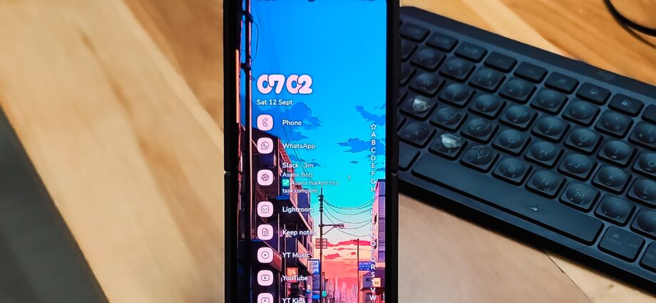
The core idea of this launcher is simple, and it sticks to it. Niagara ditches the standard Android grid of icons and replaces it with a short list of up to eight favorite apps on the home screen. Everything else gets tucked into a cascading A-to-Z index that stays out of sight until you go looking for it. You can swipe from either the right or left edge to pull it up, which is a small touch that lefties will appreciate.
What pushes Niagara past just minimal is the contextual stuff. Media controls for music, podcasts, or audiobooks appear directly on the home screen when something is playing, then disappear when you stop. The same goes for notifications. You can read and reply to messages right from the home screen without pulling down the notification shade. If you want to take it further, you can turn on a Notification Summary widget that batches distracting notifications for later, so you are not interrupted every few minutes.
Built-in app time limits nudge you, or outright force-close an app, once you’ve gone over your set limit. And the haptic feedback on the cascading app index feels like a satisfying rumble. There is also an option in the paid tier to flatten all your app icons to a single shade. It sounds purely cosmetic, but bright, colorful icons are surprisingly good at triggering impulsive tapping. Muting them removes that visual bait while keeping the launcher looking deliberate rather than broken.
Good set of customizations
Enough options to make it yours without the overwhelm
Most minimalist launchers often try to limit choices, which is not a bad thing at all for someone who doesn’t have control over their doom-scrolling habit. However, Niagara Launcher, while keeping everything minimal, still hands you a meaningful set of customization options without burying you in menus.
For starters, you can swipe right on any app, on the home screen or in the app list, to reveal hidden widgets and shortcuts. For instance, you can use this to jump straight into specific app features without opening the full app first. Tap the date at the top, and you get a quick calendar preview of your upcoming events. There’s also a Niagara Button, a small on-screen “+” icon that you can bind to instantly launch any app you pick, like Gemini or Google Search.
Organization is handled well too. You can hide apps you don’t want cluttering your list through Settings > Hide Apps, create folders from the Productivity page, and even let Niagara auto-add your most-used apps to the home screen based on usage patterns. If you want a cleaner look, free icon packs from the Play Store work fine here. The launcher also supports usage-based sorting, so apps you open most often float to the top when you search by letter. There is a backup and restore option too, so you can export your entire layout and restore it on a new device without starting over.
Finally, we have gestures. Swipe down for notifications, swipe up for search, and these can be toggled on or off in Productivity > Smart Search if you prefer different behavior. One widget slot comes free, and you can resize and reposition it with a long press. It is limited compared to what the Pro version offers, but it’s there.
The Pro version adds even more features
Widgets, pop-ups, and deeper theming for $14 a year

The free version of Niagara covers the basics well, but Pro is where the launcher opens up for people who want more out of their home screen.
The biggest unlock is the widget stack. Pro lets you stack up to four widgets in a carousel at the top of the home screen. Without Pro, you are stuck with a single widget, which can feel limiting if you rely on widgets for quick information.
Pro also adds widgets in pop-up menus. Long-press an app icon, and you can surface a widget or a shortcut instead of just launching the app. For example, you can toggle a smart light from the Google Home widget without ever opening the app itself. Beyond that, Pro throws in the full suite of themes, deeper icon pack support, and more customization options for the built-in clock, calendar, and weather widget.
Pricing sits at $24.99/year or $74.99 for a lifetime key. The app is definitely on the pricier side, especially for someone in the U.S., so you’d have to make the decision whether the Pro features are worth spending a premium on a launcher.
The launcher I always come back to
Niagara Launcher doesn’t feel like many minimalist launchers mainly because it doesn’t ask you to give up too much in exchange for a clean screen. Every time I switch to something new, I spend a week missing the cascading app index, the contextual media controls, or the quick swipe shortcuts that Niagara handles so naturally. And every time, I end up back here.
